


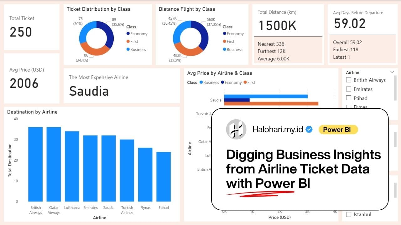

In my journey of learning data analytics, exploring airline ticket data has been one of the most engaging case studies. Previously, I conducted an analysis using a SQL-based approach, focusing on data cleaning, exploration, and answering various business questions through queries. You can read that article here where I demonstrated how SQL can be effectively used to extract insights directly from raw datasets.
However, as analytical needs evolve, relying solely on query-based analysis is often not enough to communicate insights effectively to stakeholders. Today’s data landscape increasingly emphasizes the use of Business Intelligence tools such as Power BI to create interactive dashboards and more compelling visualizations. These tools enable analysts to present insights in a way that is not only informative but also intuitive and actionable.
In this article, I revisit the same case study—airline ticket analysis—but with a different approach. Instead of focusing on SQL queries, the analysis is conducted using Power BI, with a new structure of questions that are more oriented toward business insights and data storytelling. This approach highlights how visualization can help uncover key patterns such as pricing trends, booking behavior, and demand dynamics, which are inherently volatile in the airline industry.
Through this article, I aim to demonstrate the transition from query-based analysis to visual data storytelling, which is an essential step for any data analyst who wants to deliver insights that are not only accurate, but also impactful and easy to understand.
Dataset Overview
First of all, let me introduce the dataset. I got this dataset on Kaggle.com which type of file is CSV, here is the link: https://www.kaggle.com/datasets/syedaeman2212/airline-ticket-prices-dataset. The dataset contains ticket data from eight airlines.
- Dataset Name: Airline Ticket Prices Dataset
- Rows (Records): 250 rows
- Columns (Features): 8 columns
- Data Quality: clean with no missing values (0%)
- Data Dictionary
- Ticket_ID: Numeric, unique ID for every transaction.
- Airline:Text (String), name of 8 airlines
- Origin: Text(String), origin city of departure.
- Destination: Text(String), Destination city of flight.
- Distance_km: Numeric, distance of flight route in kilometer unit
- Class: Text(String), class of flight cabin (Economy, Business, First).
- Days_Before_Departure: Numeric, the distance of time between ticket booking and the days of departure.
- Price_USD: Numeric, flight ticket price in USD.
Short Statistical Summary
- Average ticket price: $2,006.06
- The Lowest ticket price: $106.07
- The highest price: $8,852.69
- Average of flight distances: 5,999 km
- Average of booking time: 59 days before depart (H-59)
Analytical Questions
This dashboard is designed to answer several key business and operational questions related to airline ticket pricing, travel patterns, and customer behavior:
1. How do ticket prices vary across different airlines and travel classes?
By comparing average prices by airline and class, we can identify pricing strategies and premium positioning among airlines.
2. Which destinations are most frequently served by each airline?
Understanding destination distribution helps reveal airline route dominance and market coverage.
3. What is the relationship between ticket class and travel characteristics (distance and demand)?
Analyzing ticket distribution and flight distance by class provides insight into whether premium classes are associated with longer routes or specific travel patterns.
4. How does booking timing (days before departure) influence ticket pricing?
Evaluating the average days before departure helps uncover customer booking behavior and its potential impact on price.
5. Which airline offers the most expensive tickets on average?
Identifying the most expensive airline supports competitive benchmarking and pricing analysis.
6. What are the overall travel patterns in terms of distance?
Metrics such as total, average, nearest, and furthest distances provide a comprehensive view of flight coverage.
7. How many tickets are sold and what is the overall pricing trend?
Monitoring total ticket volume and average price gives a high-level performance overview.
Solution Approach
To address the analytical questions, a structured Power BI dashboard was developed using the airline ticket dataset. The approach focuses on clear data segmentation, interactive filtering, and layered visual analysis.
Here, I have divided the dashboard into two pages. The first page is the ‘Overview,’ which provides a general summary of the dataset and primarily answers descriptive questions. The second page is ‘Deep Analysis,’ which focuses on answering analytical questions such as the relationship between price and distance, departure day, flight origin and destination, and much more.
Page 1: Overview
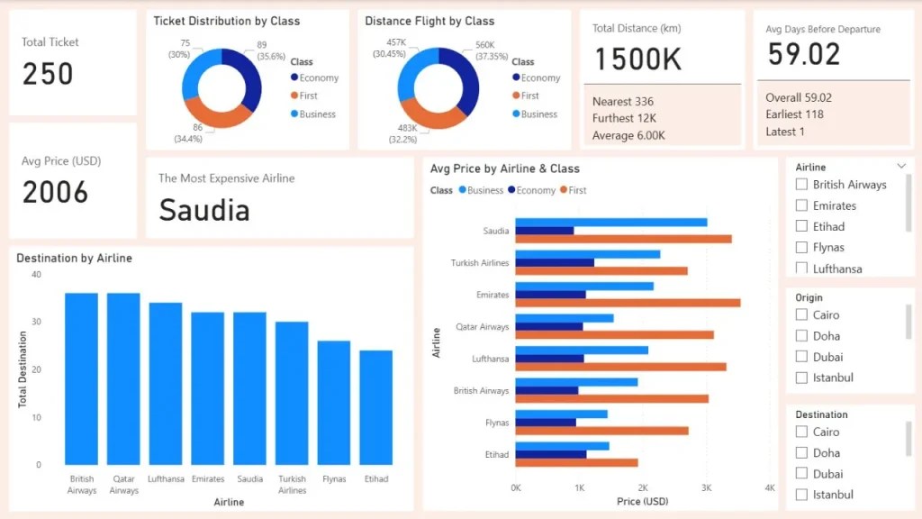
Here are the details of the first page.
1. Main Visualizations
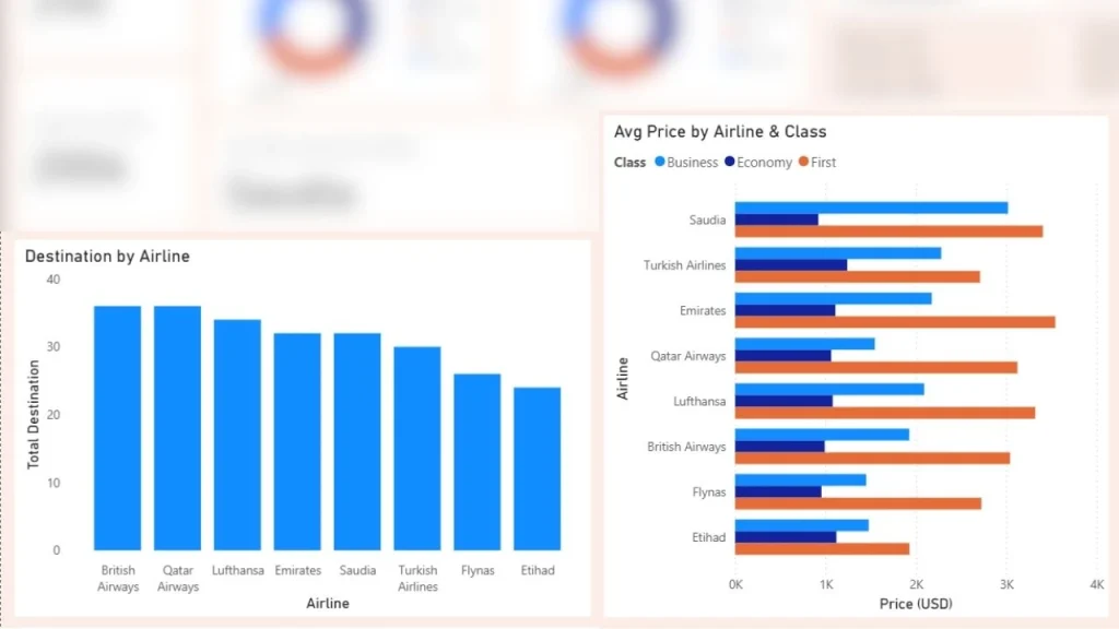
- Destination by Airline (Stacked Column Chart)
This visualization highlights how each airline distributes its flights across destinations, allowing easy comparison of route coverage and dominance.
Insight: It can be seen that British Airways and Qatar Airways dominate the aviation industry, while Etihad Airways has the smallest market share.
- Average Price by Airline & Class (Clustered Bar Chart)
This chart compares pricing strategies across airlines and ticket classes, helping identify premium vs. budget positioning. This chart help answer question number 1.
Insight: It can be seen that, on average, economy class is the cheapest, followed by business class, with first class being the most expensive. This chart shows how expensive each airline is, with Saudi Arabian Airlines being the most expensive, followed by Emirates, while Etihad is the cheapest. In fact, the average price for business class on Saudi Arabian Airlines is almost higher than the first-class fares of all other airlines combined.
2. Supporting Visualizations
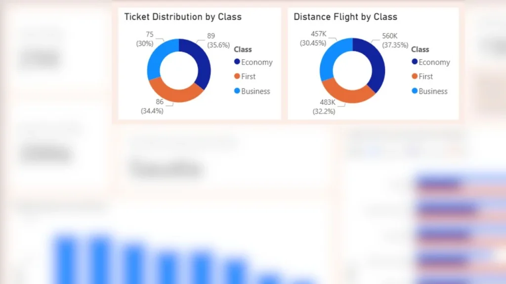
- Ticket Distribution by Class (Donut Chart)
Displays the proportion of tickets sold in each class, providing insight into customer preferences.
Insight: From this chart, I can see that economy class accounts for 35.6% of the total number of seats on the plane.
- Distance Flight by Class (Donut Chart)
Shows how total travel distance is distributed across classes, helping analyze whether certain classes dominate long-haul or short-haul flights.
Insight: Just like the previous chart, in this chart I see that economy class has the longest total flight distance.
3. Key Metrics and Cards
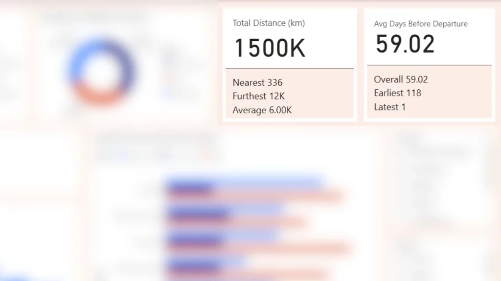
For this key metric, I used the ‘Card (New)’ feature in Microsoft Power BI, along with reference labels to explain the data in detail. This chart aswer question number 6.
Total Distance Card
Includes reference labels:
- Nearest distance
- Furthest distance
- Average distance
Average Days Before Departure Card
Includes reference labels:
- Overall average (broad view)
- Longest booking lead time
- Shortest booking lead time
4. KPI Indicators
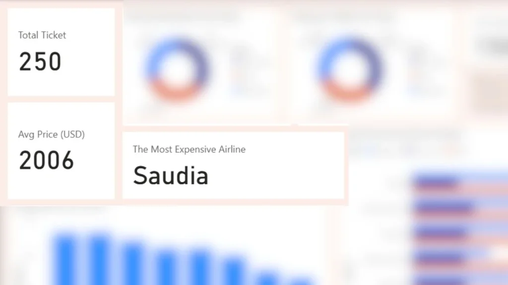
These KPIs provide a quick executive summary of performance, so this chart answers question number 7.
- Total Tickets → Measures overall transaction volume
- Average Price → Indicates general pricing level
- Most Expensive Airline → Highlights the airline with the highest average ticket price
5. Interactivity (Slicers)
To enhance user exploration, the dashboard includes slicers for:
- Airline
- Origin
- Destination.
Page 2: Deep Analysis
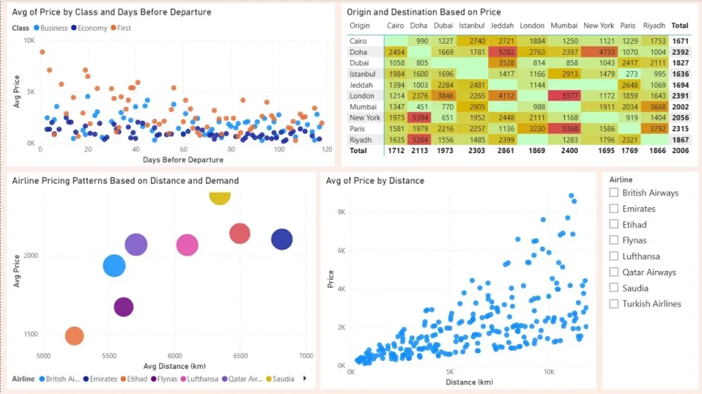
In this section, I use four charts to answer some questions frequently asked by business professionals. In addition, I also use a “Airline” slicer to provide flexibility in analyzing the data.
1. Booking Behavior & Price Sensitivity
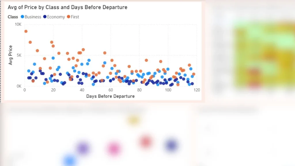
Chart: Avg Price by Class & Days Before Departure (Scatter)
Insight:
Ticket prices show a clear relationship with booking time, so this answer question number 4. In general, earlier bookings tend to result in lower prices. Upon closer examination, Economy Class is the class whose prices are not significantly affected by late bookings. Business Class is more affected than Economy Class, while First Class is the class most affected by price increases resulting from late bookings.
2. Price vs Distance Relationship
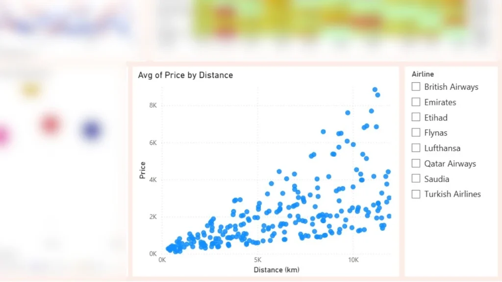
Chart: Avg Price by Distance (Scatter)
Insight:
There is a positive relationship between travel distance and ticket price, shows that longer routes are subject to higher ticket prices.
3. Airline Pricing Strategy
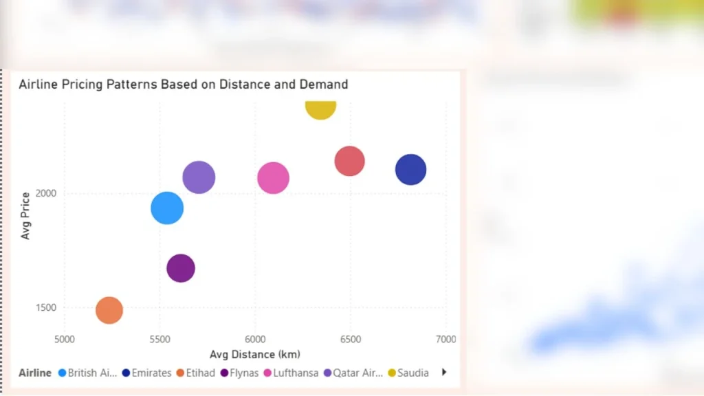
Chart: Airline Pricing Patterns Based on Distance and Demand (Scatter)
Insight:
Airlines demonstrate different pricing strategies when distance and demand are considered, this answer question number 5 and 1. British and Qatari airlines charge higher fares for the same distance, while Flynas continues to offer competitive prices. From this chart, I can conclude that Saudia Airlines has the highest ticket prices of all. Larger bubbles indicate airlines with higher ticket volume, reflecting stronger market presence.
4. Route-Level Price Analysis
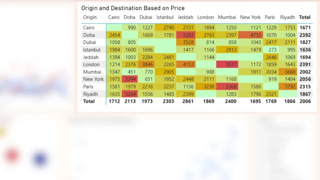
Chart: Origin vs Destination (Matrix)
Insight:
Ticket prices vary significantly across routes. Some of the routes with the highest fares are flights from New York to Doha, Doha to Jeddah, Riyadh to Doha, Paris to Mumbai, and London to Mumbai. Certain origin-destination pairs consistently show higher average prices, potentially due to demand, limited competition, or route popularity.
Insights & Findings
Based on the Power BI dashboard analysis, several key business insights can be identified regarding airline pricing behavior, customer booking patterns, and route characteristics.
1. Premium Airlines Dominate the High-Price Segment
The analysis reveals significant pricing differences across airlines. Saudia Airlines consistently records the highest average ticket prices across almost all flight classes, followed by Emirates and Qatar Airways. This indicates a premium pricing strategy, likely driven by brand positioning, service quality, or route exclusivity.
Meanwhile, airlines such as Flynas and Etihad Airways tend to offer more competitive pricing, suggesting a stronger focus on price-sensitive market segments.
2. Economy Class Remains the Primary Market Driver
Economy Class accounts for the largest share of ticket distribution and total flight distance. This indicates that the airline market is still heavily dominated by cost-conscious travelers who prioritize affordability over premium services.
The dominance of Economy Class also suggests that airlines rely heavily on high-volume ticket sales rather than premium-seat exclusivity to maintain market demand.
3. Late Booking Significantly Impacts Premium Ticket Prices
Booking timing has a stronger impact on Business and First Class tickets compared to Economy Class. The scatter analysis shows that premium-class ticket prices increase substantially as departure dates approach.
In contrast, Economy Class prices appear relatively more stable, indicating that airlines may apply more aggressive dynamic pricing strategies to premium customers, especially for last-minute bookings.
4. Longer Routes Tend to Generate Higher Ticket Prices
There is a clear positive relationship between flight distance and average ticket price. Long-haul flights generally command higher fares due to operational costs, service requirements, and passenger demand.
This pattern becomes even more visible in premium classes, where passengers may prioritize comfort and additional services during long-distance travel.
5. Certain Routes Show Strong Premium Pricing Potential
Route-level analysis highlights several origin-destination pairs with consistently high ticket prices, including:
- New York → Doha
- Doha → Jeddah
- Riyadh → Doha
- Paris → Mumbai
- London → Mumbai
These routes may represent high-demand international corridors, limited competition markets, or strategically important airline routes that allow carriers to maintain premium pricing.
6. British Airways and Qatar Airways Demonstrate Strong Market Presence
The destination distribution visualization shows that British Airways and Qatar Airways serve a broader range of destinations compared to other airlines in the dataset.
This broader route coverage indicates stronger market reach and potentially larger operational networks, which may contribute to their higher ticket volume and stronger competitive positioning.
7. Airline Pricing Strategies Differ Beyond Distance Factors
Even for similar travel distances, airlines display noticeably different pricing behavior. Some airlines maintain higher fares regardless of route length, while others compete through lower average pricing. This suggests that ticket pricing is influenced not only by operational factors such as distance, but also by branding strategy, customer segmentation, and market positioning.
Final Conclusion
This Power BI dashboard demonstrates how data visualization can transform raw airline ticket data into actionable business insights. By combining pricing analysis, booking behavior, route distribution, and distance patterns, the dashboard provides a clearer understanding of how airlines compete across different market segments.
Beyond descriptive reporting, the analysis also highlights the importance of interactive dashboards in supporting business decision-making, enabling stakeholders to identify pricing opportunities, customer behavior trends, and competitive positioning more effectively.


Exploring Python Through a Simple Cafe POS System
Mengapa Angka Kemiskinan Tidak Selalu Mewakili Realitas?
